
Once I could reliably log sensor data, store it, export it, and analyze it using tools like Pandas, it felt like the right time to take the next step.
Looking at plots after a ride was useful—but it was also disconnected from the riding experience itself. I wanted to be able to see some of the data live, while riding, in a way that actually made sense.
That naturally led to the idea of building an instrument cluster, or dashboard.
Why I wanted a dashboard in the first place
The goal of the dashboard wasn’t to show everything.
Some parameters were:
- Too noisy
- Too complex
- Better suited for offline analysis
Those would stay in the background and simply be logged.
The dashboard needed to surface only the most useful, rider-relevant information, without overwhelming the user.
That meant thinking not just like an engineer, but like a rider.
Looking for design inspiration
Before writing any code, I spent time looking at existing dashboard designs.
I downloaded images of:
- Modern superbike dashboards
- TFT instrument clusters
- Racing dashboards and telemetry screens
At the same time, I sketched a few ideas of my own to explore layout and hierarchy.
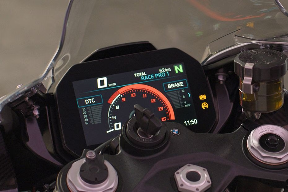
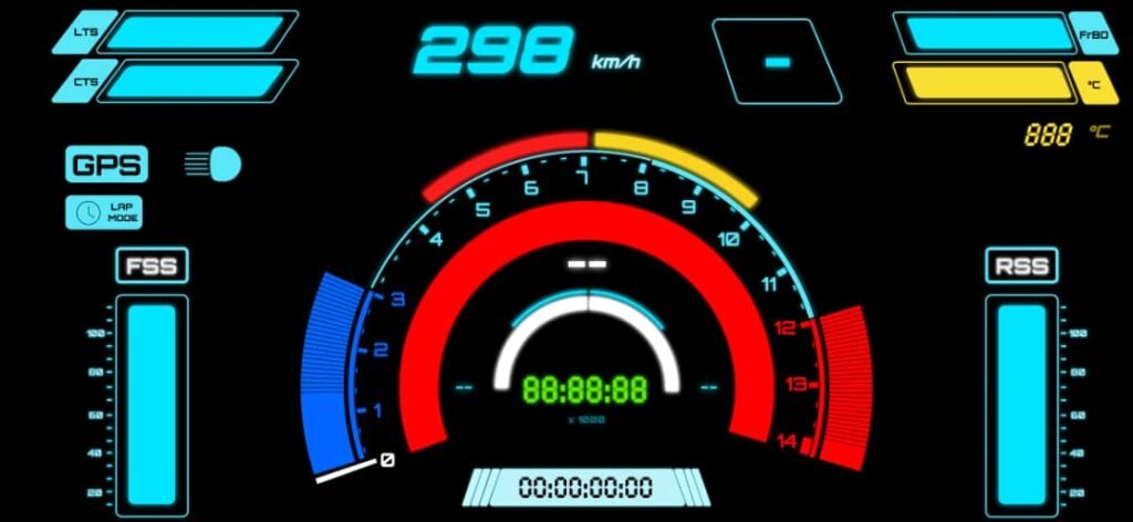
One design kept standing out: the 2025 BMW S1000RR dashboard.
It uses:
- A large TFT display
- A clean, high-contrast color scheme
- Clear prioritization of information
- Visual elements instead of raw numbers where possible
It gives the rider what they need—without shouting.
That made it a great reference point.
Constraints of my platform
The S1000RR dashboard is a dedicated hardware unit, deeply integrated into the bike’s electronics via CAN bus. My setup was very different.
- No CAN bus
- No factory ECU integration
- Wireless sensor system
- Prototype-level hardware
I didn’t want to build a physical dashboard unit at this stage. Instead, I decided to use something I already had: a smartphone.
Using a smartphone as the dashboard hardware
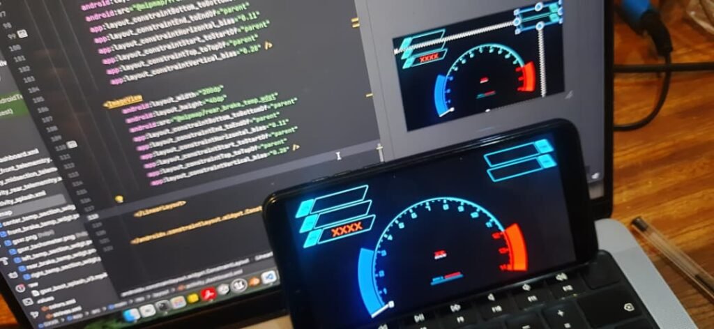
I chose to run the dashboard on an Android smartphone (Samsung Galaxy M31).
That decision came with some advantages:
- High-resolution display
- Touch input
- Built-in power management
- Easy deployment and iteration
It also meant the dashboard had to be implemented as a native Android app.
Since I already had experience with Android Studio, this felt like the most practical path forward.
Designing the UI with Figma
Before writing any Android code, I focused on the UI.
I developed some of the assets for the dashboard UI in Figma which I used to:
- Design individual widgets
- Experiment with layout
- Adjust spacing and hierarchy
- Think about how information flows visually
This made a huge difference. Being able to design visually first helped avoid a lot of trial-and-error later in code.
I wasn’t trying to copy the S1000RR dashboard, but I was trying to understand why it works.
One key lesson was restraint:
A good dashboard doesn’t show everything—it shows the right things.
Choosing what to display (and what not to)
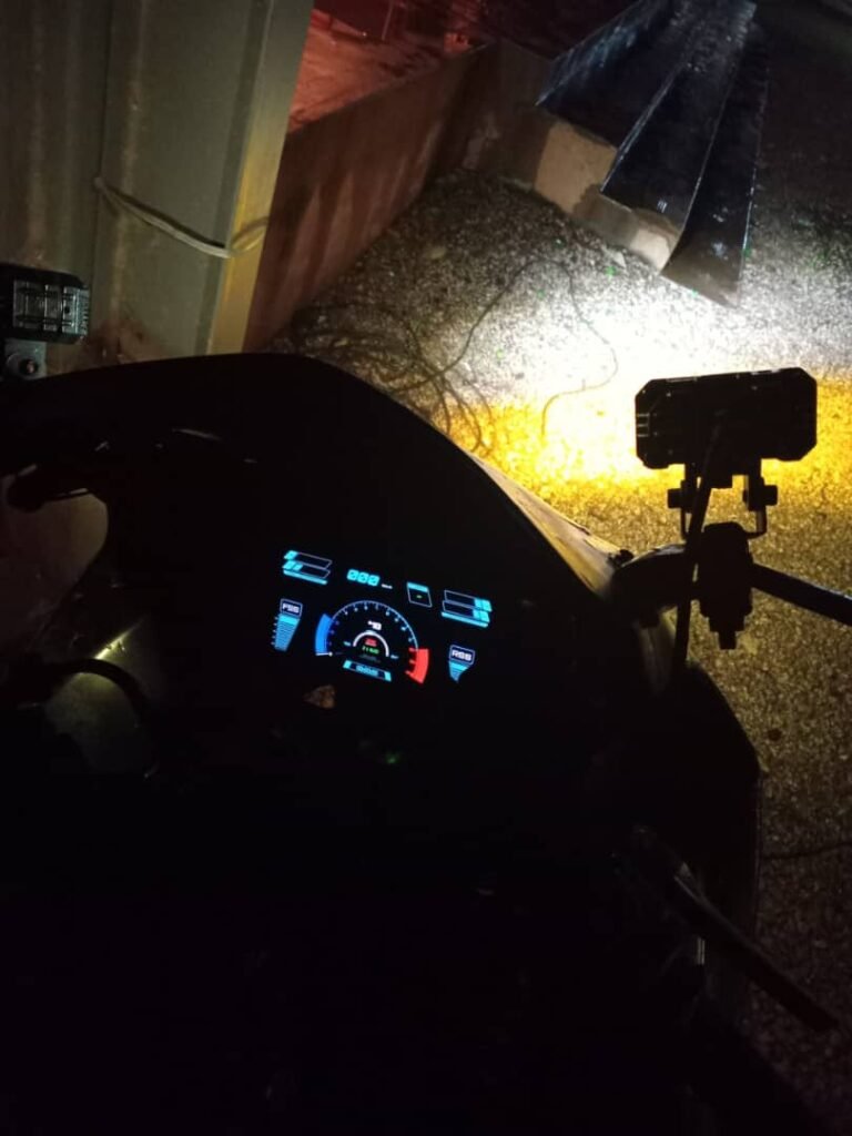
After some iteration, I settled on displaying:
- Tyre temperature parameters
- Brake disc temperature parameters
- RPM
- Speed
- Suspension state
- Gear indicator
- Lap timer
- Clock
- Brake usage indicators
- Sensor error codes (for my system, not the bike ECU)
Anything that didn’t directly help the rider stayed out of view and was only logged in the background.
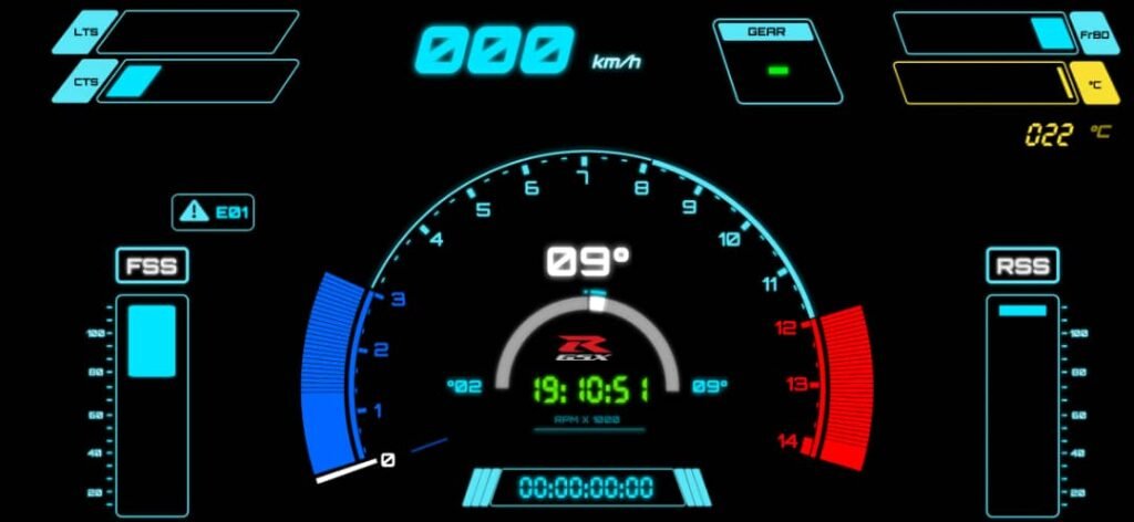
Custom widgets and visual elements
Many of the UI elements needed to be custom.
For example:
- RPM required an arc-style widget that changed width dynamically
- Temperature values worked better as bars rather than raw numbers
- Suspension state needed a visual indicator instead of a static value
Some early versions used static images to represent suspension movement, but that didn’t feel right. I wanted elements that moved and responded.
This pushed me deeper into custom widget design.
Connecting the dashboard to the data logger
The dashboard didn’t talk directly to sensor modules. Instead, it communicated with the data logging engine.
The data logging engine:
- Ran as a Python program
- Collected and logged all sensor data
- Exposed a UDP server on port 9100
The protocol was simple:
- The dashboard (or any UDP client) sends a
"REQ"message - The logger responds with a single, aggregated data frame
- The dashboard parses the frame and updates the UI
This design had a few advantages:
- Loose coupling between systems
- Easy debugging from a laptop or another device
- One unified data snapshot per request
Software gating and lap timer logic
One of the more interesting problems was implementing a lap timer without adding new hardware controls.
Instead of building a dedicated control module, I reused existing inputs:
- Front brake signal
- Rear brake signal
- Pass light trigger
The logic worked like this:
- Press both brakes → countdown begins
- After countdown → dashboard enters lap mode
- Front brake + pass light → start lap
- Rear brake + pass light → stop lap
Using the pass light prevented accidental triggering during normal riding.
This kind of software gating turned out to be surprisingly powerful. It allowed fairly complex behavior using very simple inputs.
Laptimer Demo Video: Youtube
Handling sensor errors
Another dashboard feature I added was sensor error reporting.
If a sensor failed or stopped reporting, the dashboard could show:
- Which module was affected
- That something was wrong
This made diagnosing issues much easier, especially during test rides.
Learning restraint in dashboard design
As the dashboard evolved, I started removing things.
At one point, I even had a GSX-R logo on the screen—but over time it felt like clutter. It didn’t help the rider, so it had to go.
This process reinforced a key lesson:
If a UI element doesn’t help in the moment, it doesn’t belong on the dashboard.
That philosophy clearly came from studying well-designed OEM dashboards like the S1000RR.
Frontend and backend on the same device
In the final setup:
- The data logging engine ran as a backend Python process
- The dashboard ran as a foreground Android app
- Both lived on the same device
Structurally, it wasn’t that different from a typical software system:
- Backend collects and serves data
- Frontend renders it for the user
The difference was that the “backend” was talking to real hardware mounted on a motorcycle.
Why the dashboard mattered
Building the dashboard changed how the project felt.
It turned:
- Abstract plots into real-time feedback
- Logged data into actionable awareness
- A sensor experiment into something closer to a real system
It also made clear just how much thought goes into human-machine interfaces on modern motorcycles.